
文字のアニメーション
グラデーション文字や波のような文字、タイピング風に出現する文字などを紹介します。
グラデーション文字

まずはこちらのグラデーションの文字をやっていきましょう。
色を決めて、対象の要素に次のコードを適用してください。
CSS
background: linear-gradient(0deg,#67bfd5,#f7cd39);
background: -webkit-linear-gradient(0deg,#67bfd5,#f7cd39); copied!
これだと黒い文字にグラデーションの背景がついただけなので、次のコードも適用してください。
CSS
-webkit-background-clip: text;
-webkit-text-fill-color: transparent;これでできました。
他にも色を増やしたり、角度を変えてもいいでしょう。
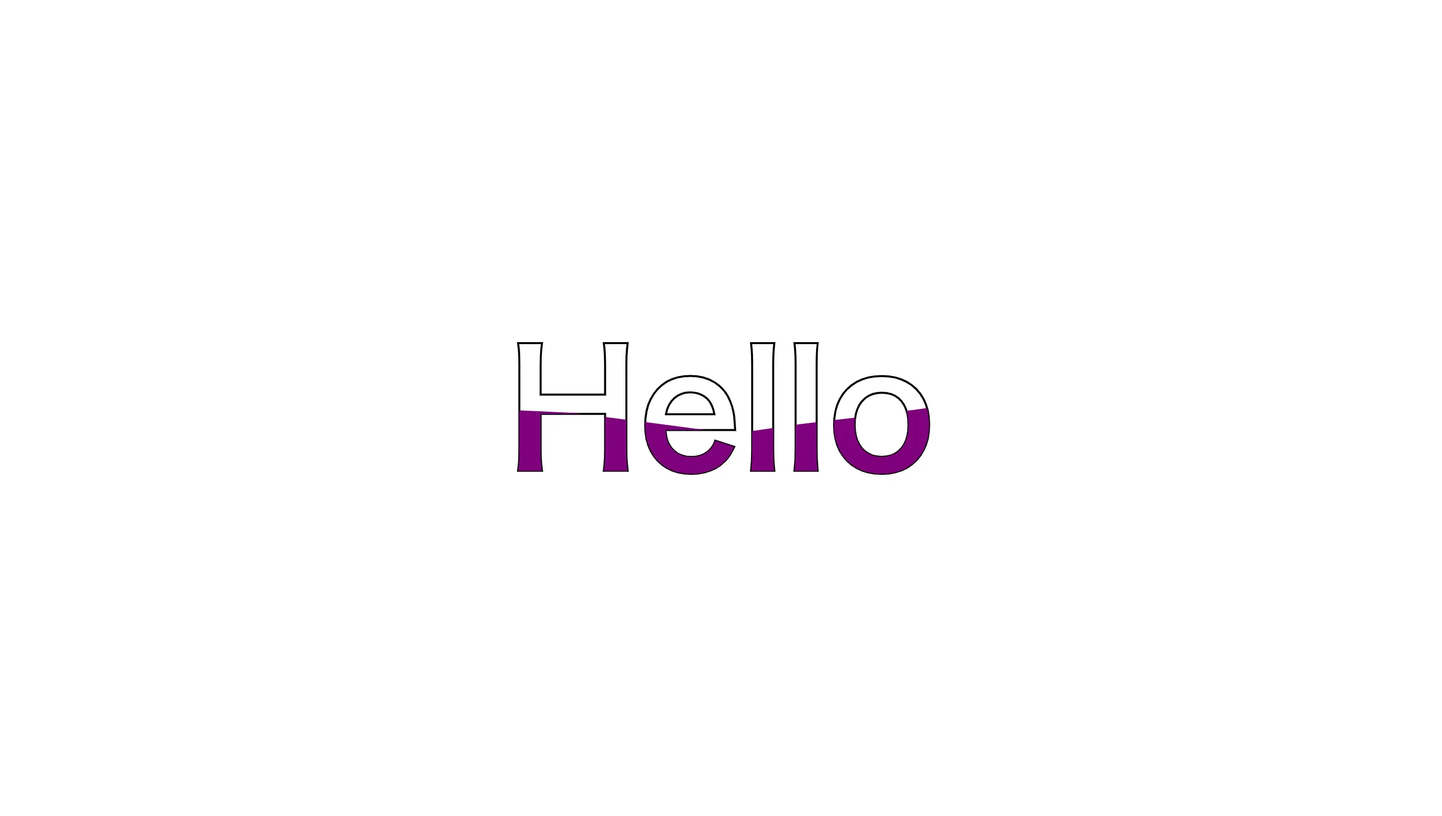
波
波のようなアニメーションを作ります。
次のようにdivタグの中にテキストを二つ用意します。
HTML
<div>
<h1>Hello</h1>
<h1>Hello</h1>
</div>CSS
div {
position: relative;
}
div h1 {
color: black;
position: absolute;
transform: translate(-50%, -50%);
font-size: 10rem;
}
div h1:nth-child(1) {
color: transparent;
-webkit-text-stroke: 2px black;
}
div h1:nth-child(2) {
color: purple;
animation: animate 4s ease-in-out infinite;
}
@keyframes animate {
0%,100% {
clip-path: polygon(
0% 45%,
16% 44%,
33% 50%,
54% 60%,
70% 61%,
84% 59%,
100% 52%,
100% 100%,
0% 100%
);
}
50% {
clip-path: polygon(
0% 60%,
15% 65%,
34% 66%,
51% 62%,
67% 50%,
84% 45%,
100% 46%,
100% 100%,
0% 100%
);
}
}cssのanimationでclip-pathという要素を切り抜くようなプロパティを使用して、波のような要素を作っています。
animation: animate 4s ease-in-out infinite;4sを変えてアニメーションの速度を変更したりしても面白いと思います。
color: purple;波の色を変えたければここ。
-webkit-text-stroke: 2px black;ここでは文字の縁の太さと色を変更できます。
また、今回はclip-pathのpolygon関数を使用しましたが、ellipse関数などを使えば星などの複雑な図形も描くことができるので試してみてください。
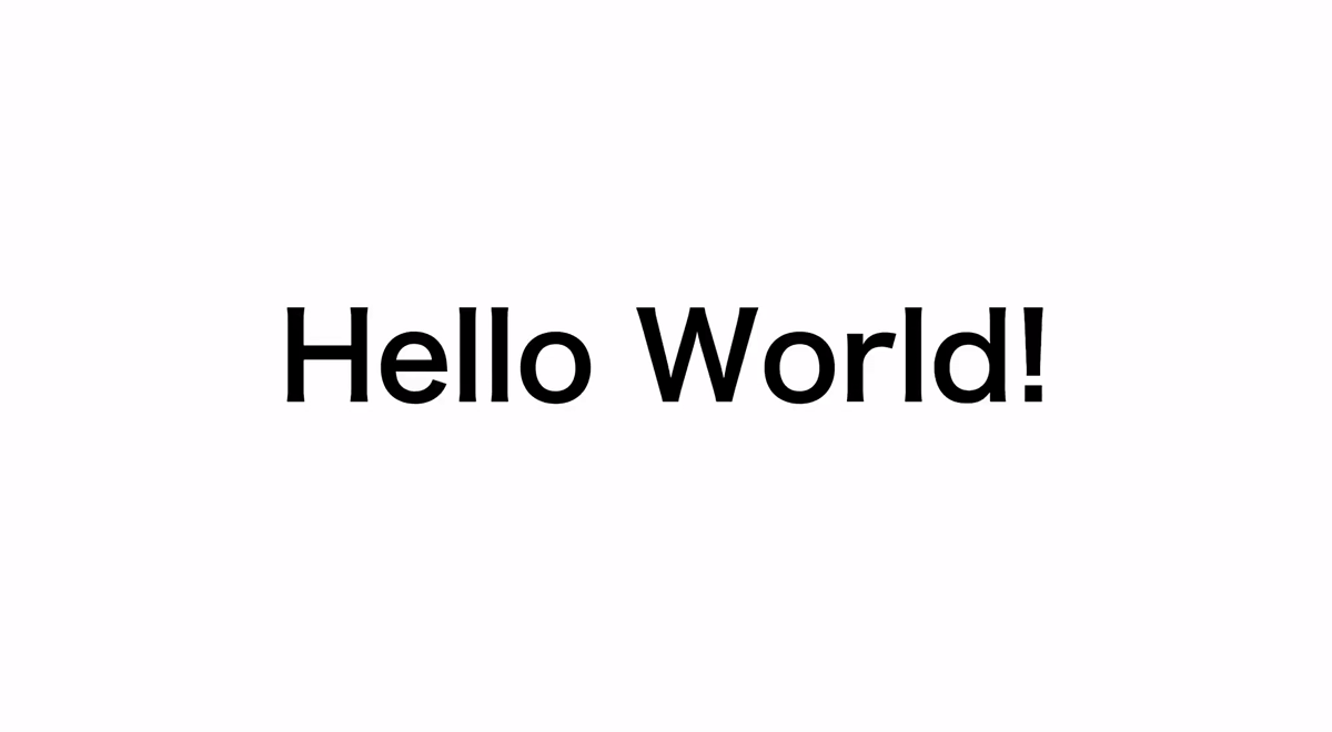
タイピング
↓
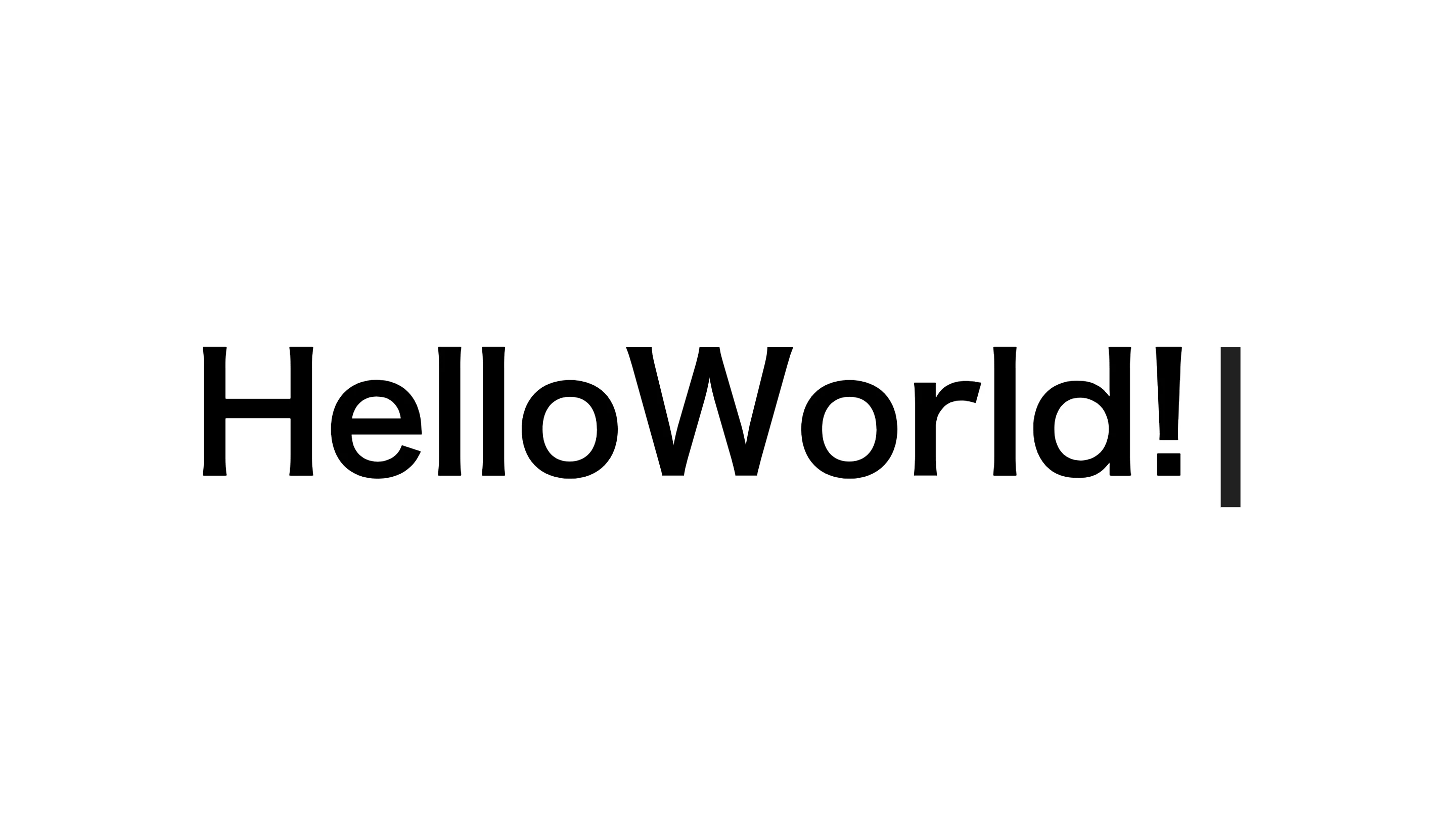
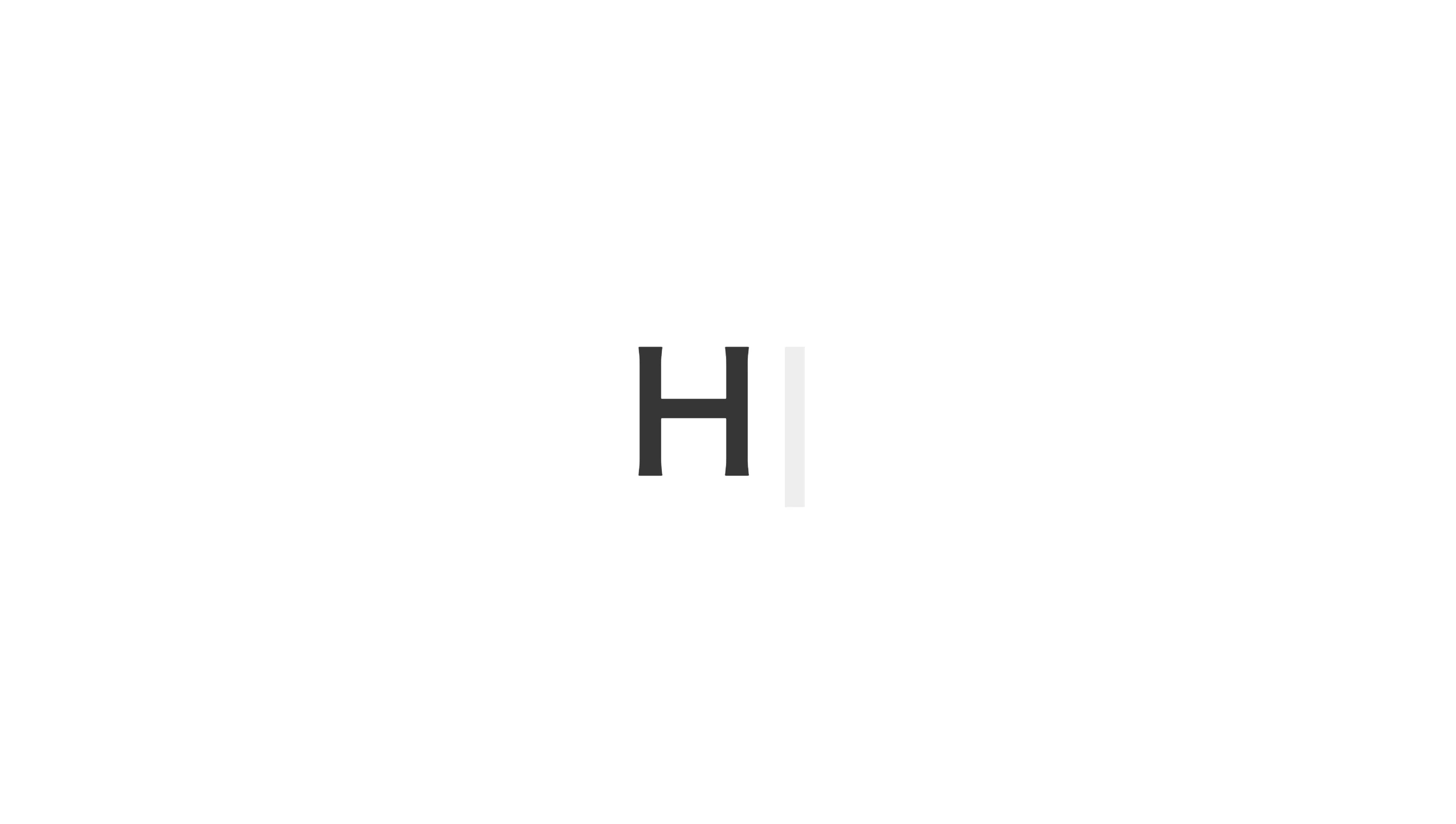
文字がタイピングされたように表示させます。
HTML
<h1 class="text">Hello World!</h1>次のコードはbodyタグかheadタグのどちらかにコピペしてください。
<script src="https://code.jquery.com/jquery-3.4.1.min.js" integrity="sha256-CSXorXvZcTkaix6Yvo6HppcZGetbYMGWSFlBw8HfCJo=" crossorigin="anonymous"></script>CSS
.text {
display: flex;
font-size: 10rem;
}
.text span {
display: none;
}
.text::after {
content: "|";
animation: typinganime .8s ease infinite;
}
@keyframes typinganime{
from{
opacity:0
}
to{
opacity:1
}
}今回はjQueryも使うので、Javascriptファイルを作って読み込んでください。
Javascript
function TextTypingAnime() {
$('.text').each(function () {
let elemPos = $(this).offset().top - 50;
let scroll = $(window).scrollTop();
let windowHeight = $(window).height();
let thisChild = "";
if (scroll >= elemPos - windowHeight) {
thisChild = $(this).children();
thisChild.each(function (i) {
let time = 100;
$(this).delay(time * i).fadeIn(time);
});
} else {
thisChild = $(this).children();
thisChild.each(function () {
$(this).stop();
$(this).css("display", "none");
});
}
});
}
$(window).on('load', function () {
let element = $(".text");
element.each(function () {
let text = $(this).html();
let textbox = "";
text.split('').forEach(function (t) {
if (t !== " ") {
textbox += '<span>' + t + '</span>';
} else {
textbox += t;
}
});
$(this).html(textbox);
});
TextTypingAnime();
});これで先ほどの画像のようになったと思います。
一文字ずつ表示して、H1タグの擬似要素afterに|を指定することでタイピング風にしています。
カスタマイズ
カスタマイズと言ってもほとんどありませんが、Javascriptの下記のところを変更するとタイピングの速度が変わります。
let time = 100;100を小さくすると速く、大きくすると遅くなります。
便利なサイト
グラデーションを作成するときに役立つサイトをいくつか紹介します。
uigradients
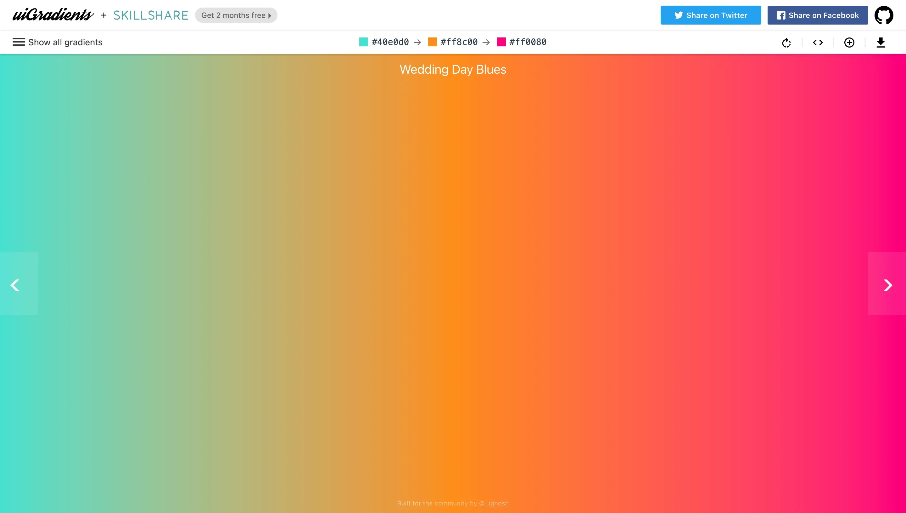
綺麗なグラデーションがたくさんあるので参考にしてみてね。
cssgradient
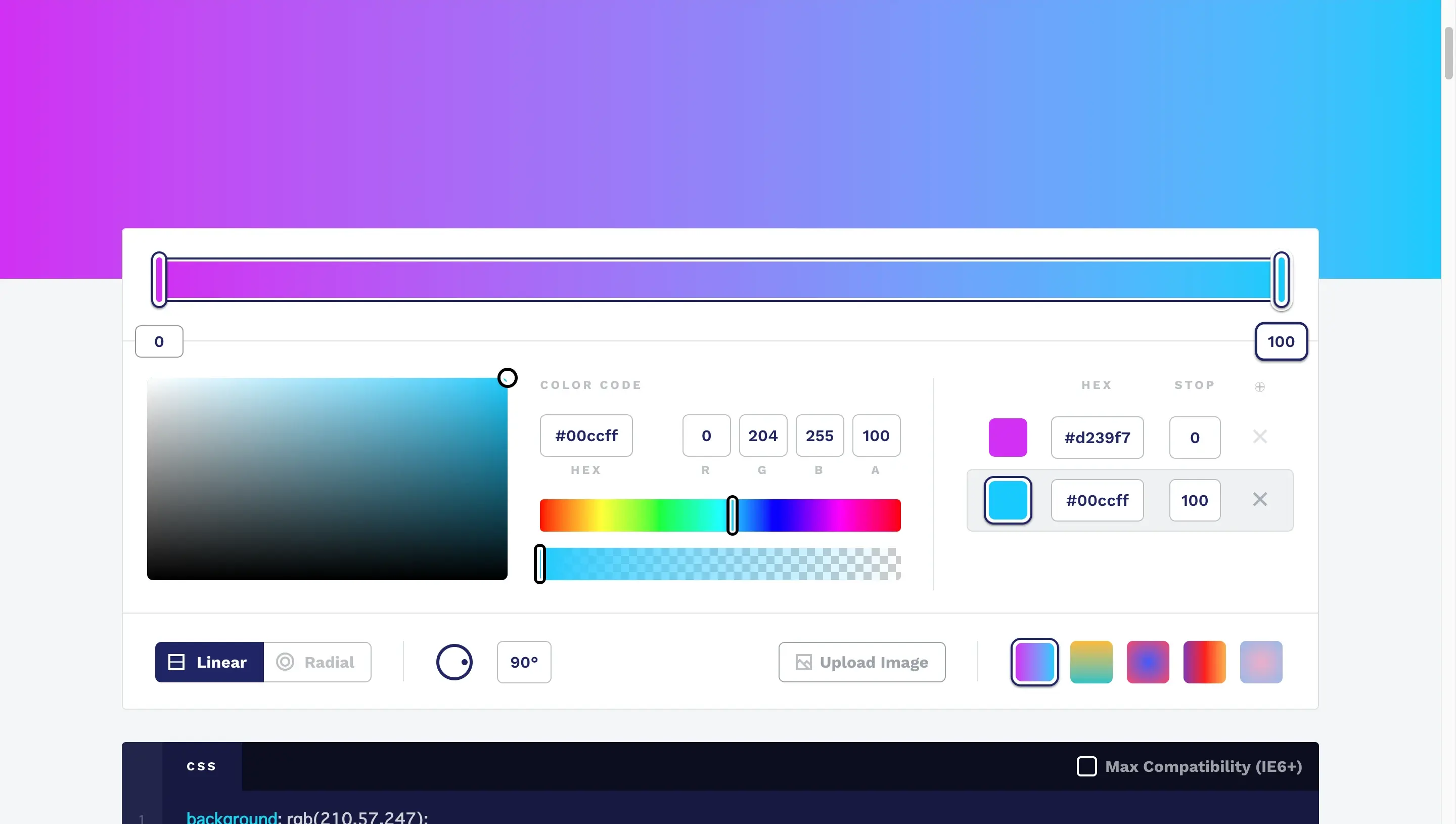
自分で色を決めたりしてグラデーションを生成できます。
ourownthing
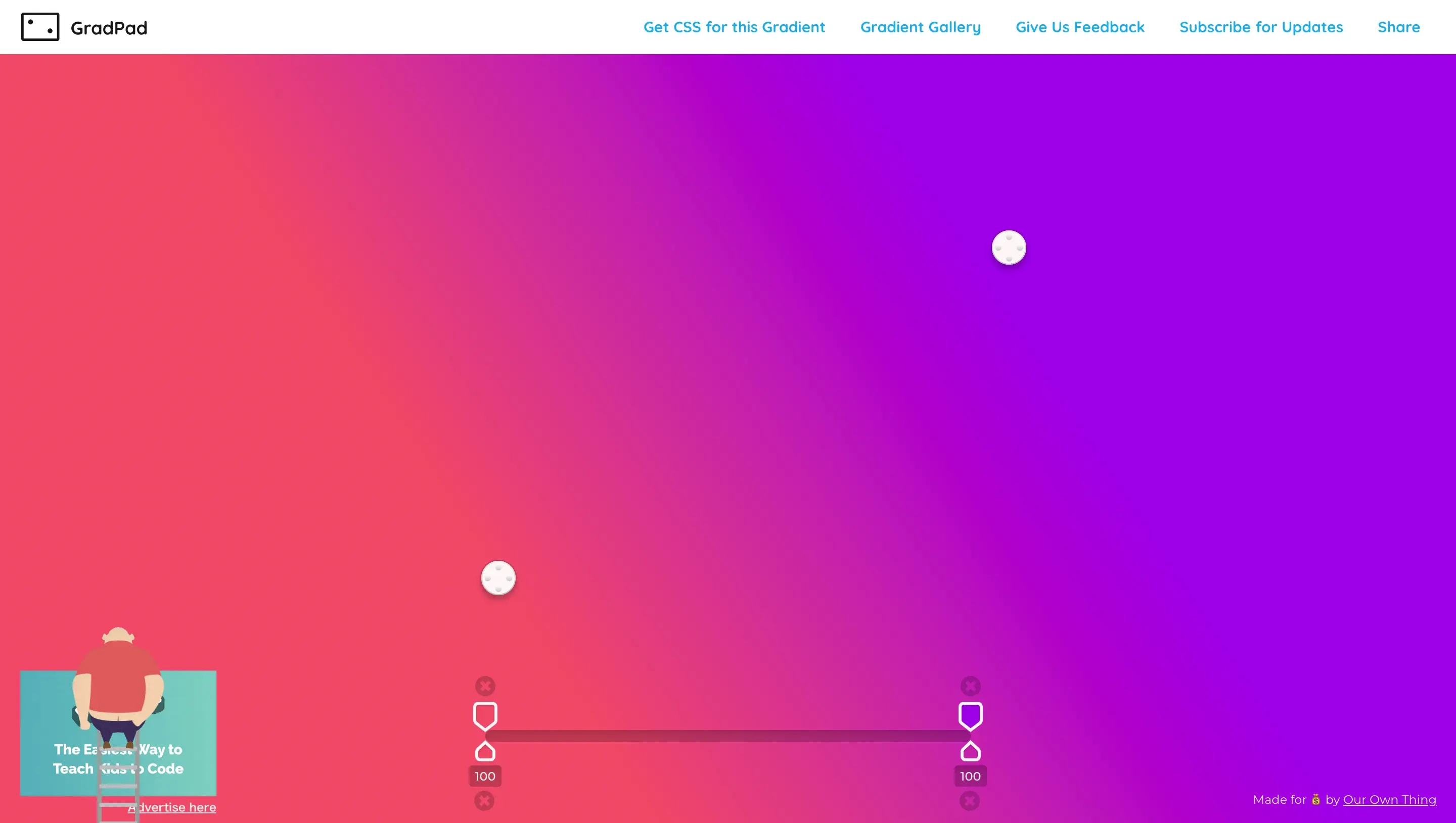
わかりやすいUIで使いやすいです。
最後にリンクですが他の記事で紹介した、下画像のようなランダムに出現する文字を紹介します。
テキストをシャッフルさせる方法